
Designing your wedding with Rose Quartz & Serenity by Victoria Denofrio
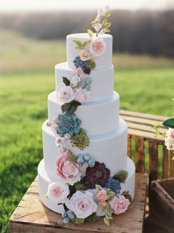
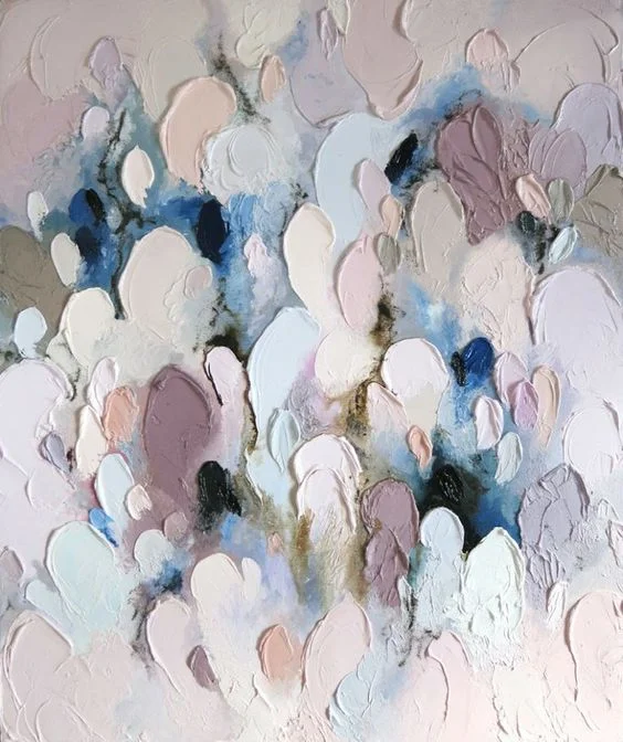
Pantone’s 2016 colours- gorgeous hues of Rose Quartz and Serenity Blue, lends a softer side to design your special day with. Whether your taste is vintage, rustic, contemporary, botanical or minimalist, these hues can and will take your breath away.
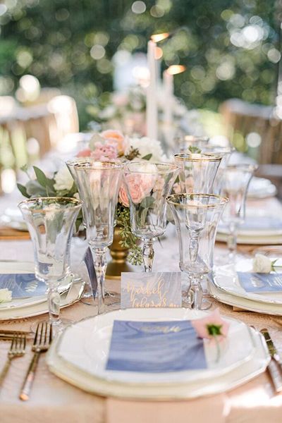
It's imperative you pair Rose Quartz & Serenity properly or face the potential unintended consequences of your wedding looking like a baby shower. When your designing with a specific palette, be mindful to ensure the right shades are chosen for a cohesive and seamless look.

"My favorite way to add color is in the details. Tasty drinks, silk hand tied ribbons, stationary and the like. Think big picture, while ensuring your details aren't overdone. Compartmentalize your design areas, then like a coloring book, choose where you feel your color should be. If your table cloth is Serenity, avoid using that same colour for your napkin and table menu. Instead use the color for your stationary typography with a serenity ribbon detail and Rose Quartz floral centerpieces."
-Elise


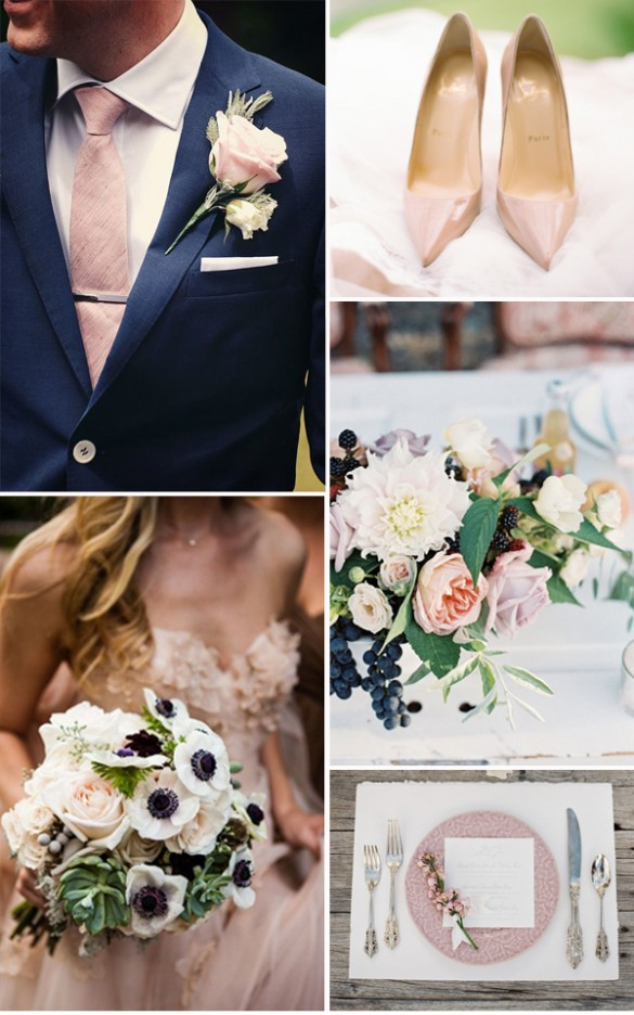
If a fully pastel scheme just isn't your style, adding muted shades and the bold pop of a dark colour may give you that sense of adventure your looking for. Feminine, yet lends to the gentlemen; like a navy blue suite!

For picture references & credit, see our Pinterest account for more details and image links.